MOJO Illustrative Type Experimentations
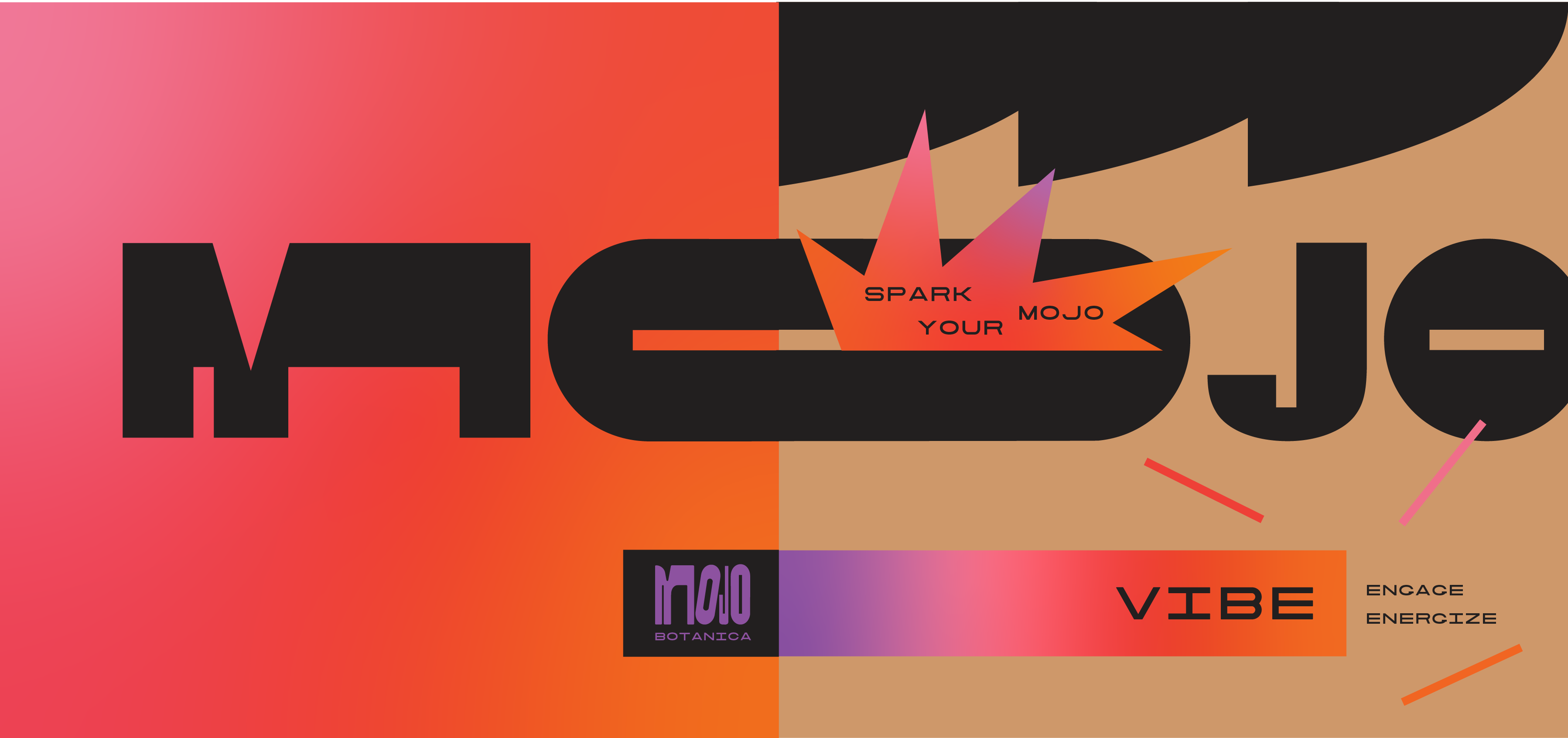
LOGO DESIGN, illustration + package designAn exploration of logo experimentation for MOJO Botanica, where the word MOJO is transformed into bold, dynamic shapes to reflect a playful and energetic brand identity system. The striking letterforms are creatively adapted into packaging, appearing as enlarged faces and stretched or condensed in different areas to convey movement, joy, and passion. The word MOJO can be condensed into MJ, introducing another creative and versatile element to the system. Gradients enhance the design with a vibrant color palette, seamlessly complementing the expressive extensions of the letterforms.


